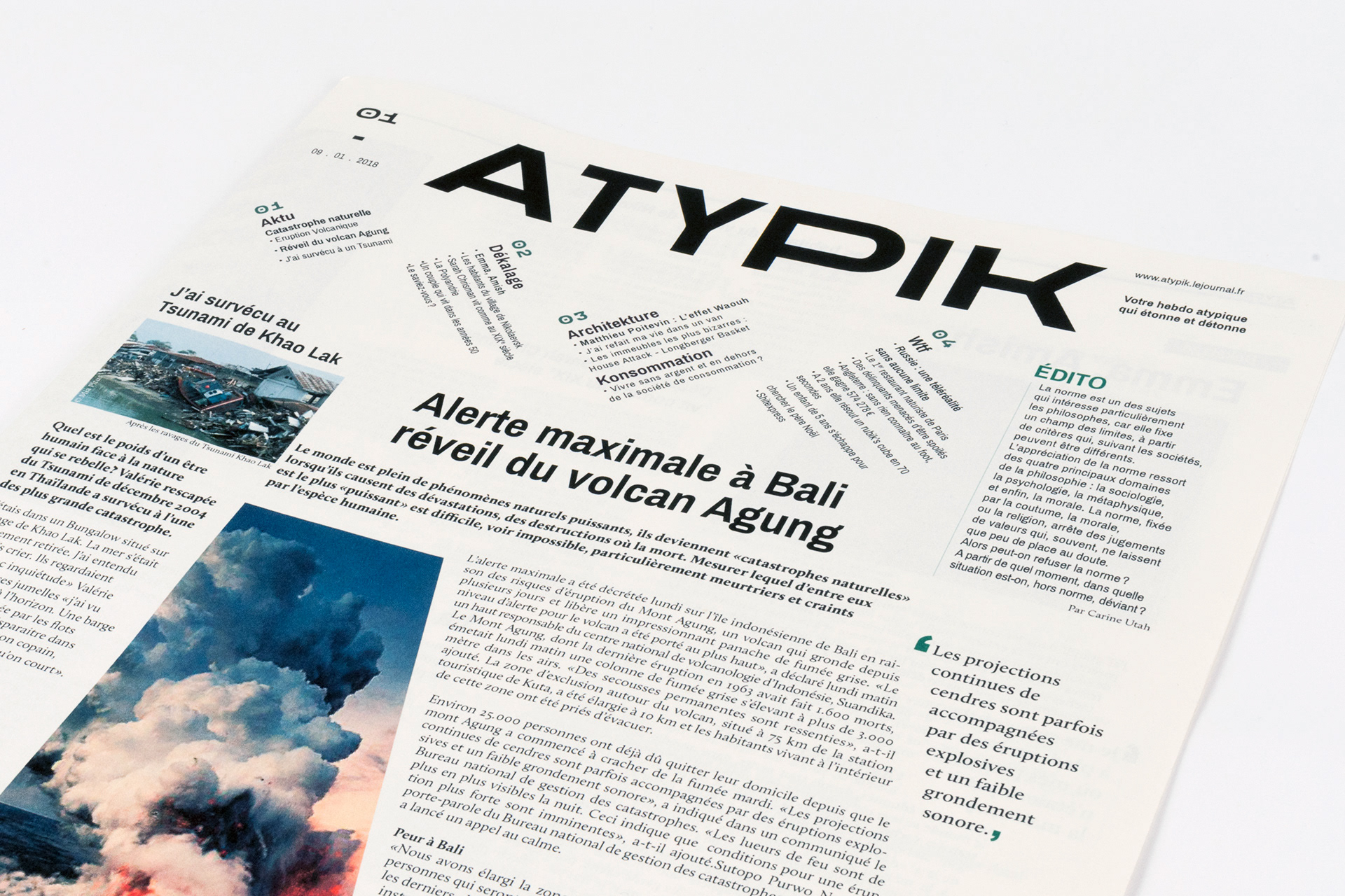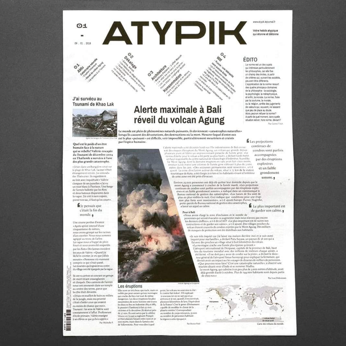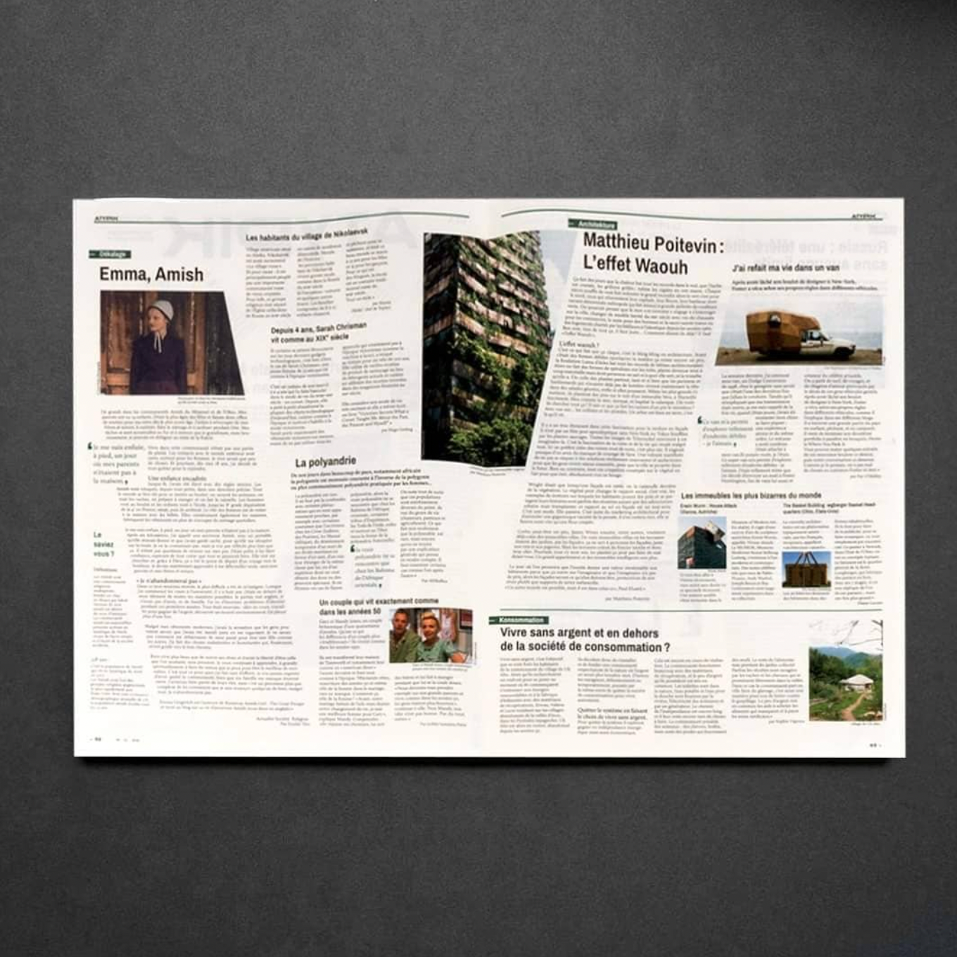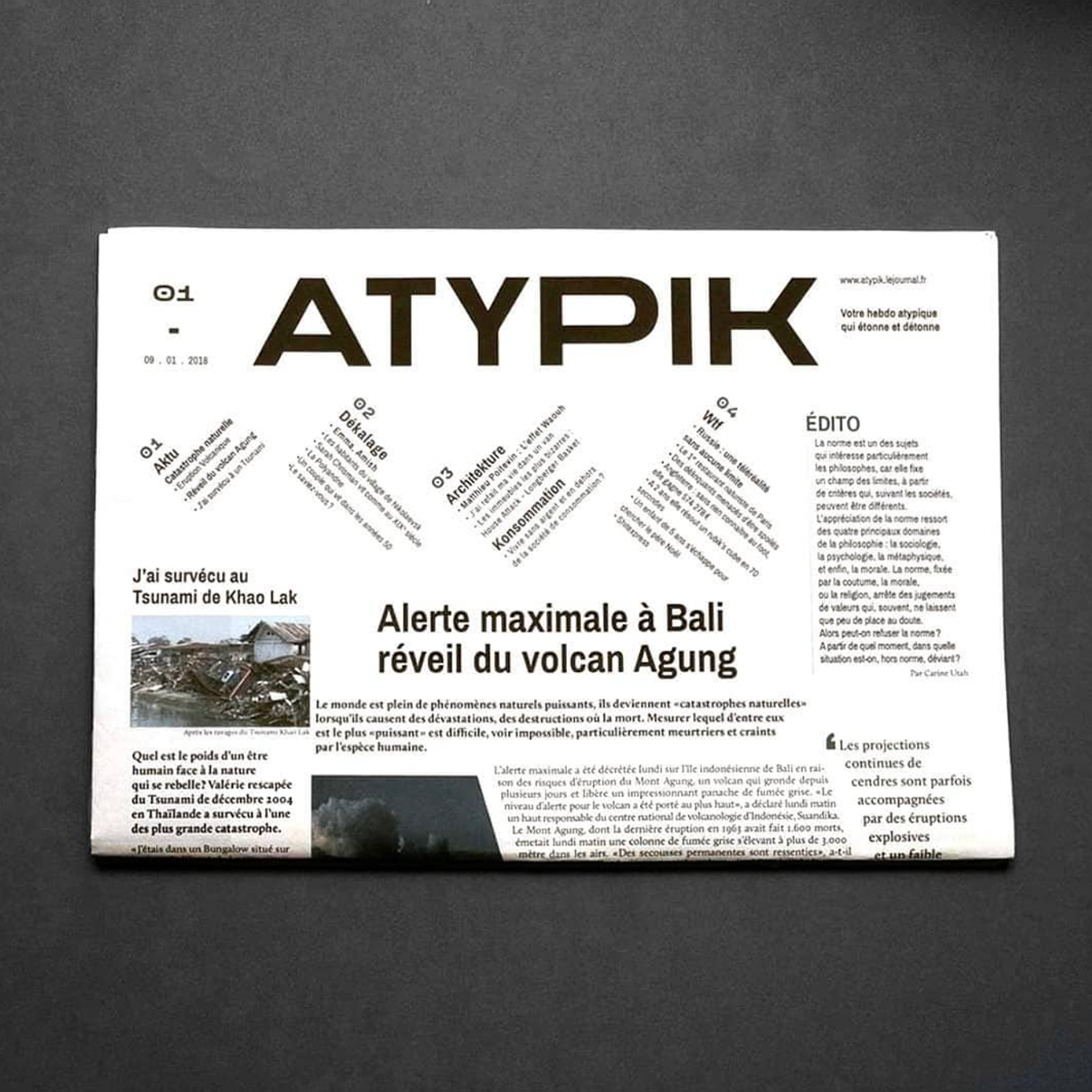
Atypik is a newspaper made with Louise Pasquier. It deals with incredible and atypical information in the world. That’s why we opted for an original layout with diagonal columns and an offbeat summary.
The aim of this project was to create a strong sense of balance. We had to convey and idea and tie the design with the key element. We wanted to lead the eye on the title and to focus on a big news in order to emphazise the main aim of the project.
We had to play with white space, used strategically, it help to boost the design's clarity and overall look balancing out the more complicated and busy parts. It help the design to breathe so that's why we put space between body text in order to balance out the page layout.